Enham Trust
Revealing 'The Power of Yes!
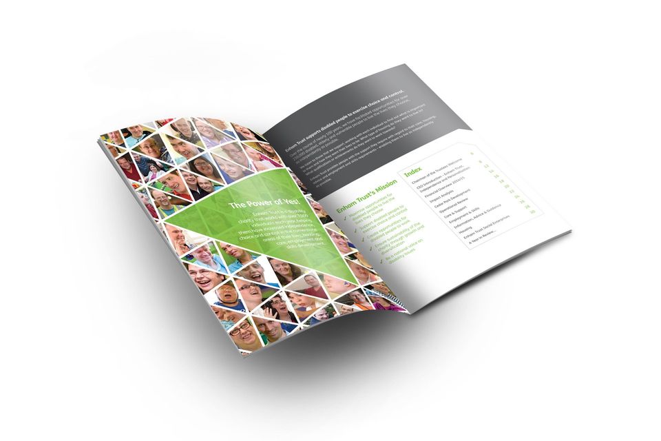
Enham Trust is a disability charity that works with over 8,500 individuals each year, helping them have increased independence and choice in the cornerstone areas of their lives.
EVALUATION
Have spent almost 18 months rebranding, the charity had a shiny new identity and the strapline, The Power of Yes. But something wasn't quite right. The use of black and white images seemed very sombre and didn't really convey the positivity suggested by the strapline.
DIFFERENTIATION
Having spent some time at Enham, it was obvious that the real difference in this amazing charity was the people. All of the disabled people that Enham Trust help have the most amazing spirit and positive outlook on life. Our visit there was genuinely moving. So it seemed obvious to bring this to the fore.
EXPRESSION
To reflect the upbeat nature of the entire organisation, images were changed to colour and clients were shown facing the camera and looking happy and positive about their world.
ACTIVATION
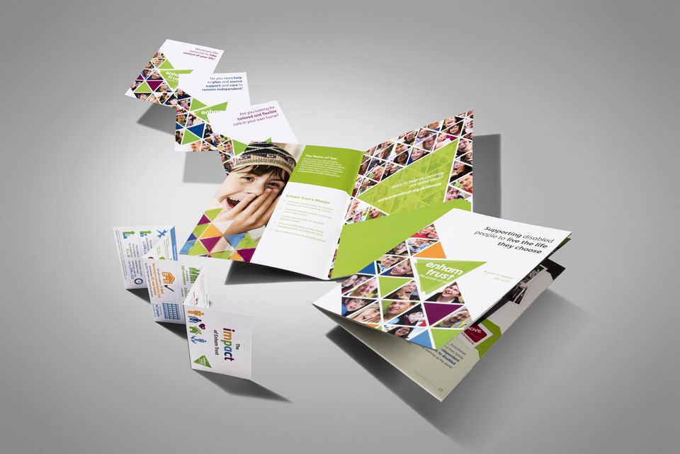
The style has been applied across a whole range of materials both online and off including the Annual Review, fundraising direct mail, regular newsletters, advertising and literature. Here are just a few examples of the work we have produced.
We’re very proud of our association with Enham Trust and the fantastic work that they do every day.